Most of my comics reading this week has been (finally!) buckling down and working my way through the IDW Transformers Humble Bundle from, like, a year ago. It’s pretty terrific, but I don’t think I have anything to say about it (not yet, anyway) other than “More Than Meets The Eye is the greatest replacement for the Giffen/DeMatteis Justice League that I’ve ever read,” and that’s the highest praise I can give. It’s terrific, and if you’ve been dragging your feet like me, un-drag ’em.
But second issues came out for a number of books whose first issues had underwhelmed me. And since we did a whole roundtable about “What makes a good first issue,” I figured it was only appropriate to look at these second issues in light of what I thought of the firsts. Would they improve? Would the added space allow for added depth and therefore added enjoyment? WOULD I BE A HAPPIER, BETTER HUMAN BEING?!?!?
Mostly, the answer was no. But read the details below anyway!
HUCK #2
Some summary excerpts from my review of issue #1: No one is clearly defined as a character … Rafael Albuquerque seems just as baffled as I am by some of these things … this is shaping up to be another brisk-but-kinda-dumb self-contained read from Millar
Thoughts on issue #2: This is just a baffling, baffling book. Maybe it’s all some elaborate meta joke where the lead character — who is supposed to be “special” or otherwise slow — deliberately reads almost exactly like any of Mark Millar’s other superheroic leads. But I kinda don’t think so.
All of the problems with the first issue are exacerbated here: it’s never clear why anyone does anything, none of the characters feel two-dimensional (let alone three-dimensional), and the tone is so far all over the place that only Matthew Vaughn will be able to make the movie version. (If The Kingsman showed one thing, it was that Vaughn can match Millar bizarre tone shift for bizarre tone shift.)
Anyway, yeah, the plot advances apace, and I struggle to care. The ending is given the pacing and framing of a major cliffhanger, but I can’t really figure out why the relevation is a cliffhanger — or, in fact, a revelation. When you don’t know anything about any of the characters, it’s kind of pointless to try to frame the reveal of a specific piece of information as particularly shocking.
But, hey, the people in the letters column/hype page think it’s the bee’s knees, so who am I to judge?
THE GODDAMMNED #2
Some summary excerpts from my review of issue #1: technically impeccable and perfectly entertaining, but there’s something about it that feels deeply over-entertained by its own blasphemy
Thoughts on issue #2: Well, it still feels deeply over-entertained by its own blasphemy, but I have real trouble considering this “technically impeccable”. Characters are not introduced (or reintroduced), no one appears to be a recognizable human being, and the world is strangely ill-defined. I suspect that Jason Aaron views all of these issues as features rather than bugs — “The Bible doesn’t have well-defined characters or a clearly formed world either, MAN!” — but it’s falling flat for me.
RM Guera’s art is very good, but also seems ill cast in this project. The tone Aaron’s writing for feels more like Philip Bond or Simon Bisley to me (or Geoff Darrow?) — someone who can take cartoonishly over-the-top violence even further over the top. Guera’s strengths on Scalped were in the … not quite realism, per se, but the ability to depict violence in a visceral way; his characters always feel oddly sinewy to me.
Every so often a project comes along where I find myself saying, “Hey, I like the creative team and the idea had some promise, but this just isn’t a book for me.” I have a feeling this is one of those projects for me with Aaron, whose work I generally really like. I’ll probably keep checking in if review copies keep turning up, but things will have to turn around pretty drastically for me to buy back in.
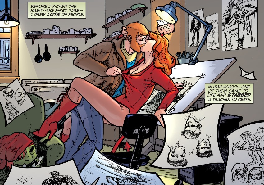
SUPERMAN: AMERICAN ALIEN #2
Some summary excerpts from my review of issue #1: one good scene, in which young Clark goes to the drive-in to see E.T. … Spending an entire issue on that–that woulda been an interesting short-story take on Clark’s childhood. This dumb crap with Pa Kent coming to terms with being human and teaching his son how to fly, though…not so much.
Thoughts on issue #2: Y’know what I want from a story about Superman as a boy? VIOLENCE. GRITTY, GRITTY VIOLENCE. AND ALSO IMPLIED CURSING.
I’ve often sat back and wondered, “Hey, did Superman ever BURN THE ARMS STRAIGHT OFF A DUDE when he was a kid?” And now I know.
Writer Max Landis seems to think he’s saying something deep and literary and important about Superman here, but it’s pretty much totally failing to land for me. The thematic throughline on this issue appears to be … um … that Superman should work with the cops? That teenagers are violent? That being a teen is, like, hard and stuff? I really have no idea.
What makes it more of a pity is that yet again Landis does a good job with the more soap opera-esque aspects of Clark’s childhood with powers. The flirtation with Lana Lang is crisp and believable (and ends with a legitimately amusing gag); the bro-ing it up and talking about using his X-ray vision to see through people’s clothes fits the milieu (although I’m kind of surprised that DC allowed that, as well as Clark’s underage drinking) … like with the E.T. bit in issue #1, Landis is doing a good job of selling me on a teen soap opera about a Superman-like character. But every time he goes for action or for quiet literary ideas, or, really, anything reliant on Clark Kent as we know him, the book totally loses me.
Art this issue comes from Tommy Lee Edwards, whose work perfectly suits the story (which sounds like a shot, given how I reacted to the story, but isn’t meant that way. This may not feel like anything I want to read about Superman, but it works better as a piece about a Superman knock-off, and in that context Edwards’ art works really well).
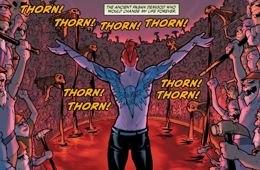
RED THORN #2
I didn’t review the previous issue here, but my thoughts on it were, basically, that it read like someone trying too hard to pastiche mid-to-late-1990s Vertigo books, and that it also contained the single stupidest panel of a comic book that I read this year:
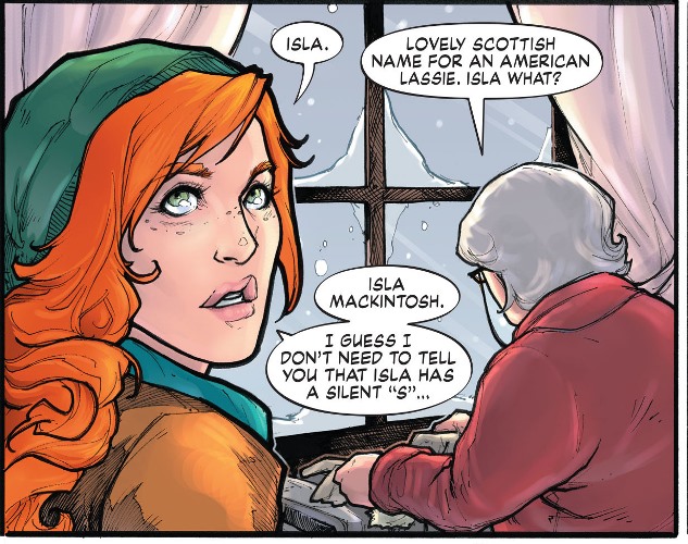
OF COURSE YOU DON’T NEED TO TELL ME THAT BECAUSE I JUST HEARD YOU SAY IT OUT LOUD AND REPEATED IT MYSELF, AND ONLY THE READER NEEDS THAT EXPLANATION GAAAAAAAAHHHHHHHHHHHH
Thoughts on issue #2: Well, at least this issue didn’t contain a panel nearly as stupid as that. But writer David Baillie’s story still feels bizarrely like Vertigo Mad Libs: a weird godlike figure trapped for years (like in Sandman)! But he’s handsome in a smooth-faced, sinister way (like in Lucifer)! There’s mythic creatures come to life (like in, I dunno, Fables or The Dreaming or something)! There’s a cranky, sassy female lead (like in House of Secrets)! There’s some vaguely metafictional chatter about the power of art (like in, like, everything)!
It all feels remarkably derivative, and it isn’t helped by the breathless, overpraising pull quotes on each of the first two issues, the first comparing it to “prime Vertigo” and the second heralding it as the Mona Lisa of the “Vertigo renaissance”. It’s also not helped by how well-worn some of the writing is; this is a book that deploys a “he’s standing right behind me, isn’t he” gag without any discernible element of irony.
What’s NOT totally indebted to 1990’s Vertigo are Meghan Hetrick’s art and Steve Oliff’s coloring. The art is gorgeous, bold-lined and cartoony and sexy and expressive, in a way that I’d love to see leveraged on a much livelier, more novel script. It’s as far as possible from Michael Zulli’s feather-delicate pencil drawings of sad people being sad, or William Simpson’s grimy, sketchy London, and the coloring accentuates that distance. Instead of the near-monochrome washes of brown and yellow and bruise-purple and gray, this is bright, shiny coloring that wouldn’t look out of place on one of those IDW Transformers books.
Between the sexy demigod and the sassy female lead and the bright colors, this has the brain-candy feel of Twilight by Vertigo, so hopefully I’m just way outside the target market and somewhere thousands of Twihards are totally digging it.

Please give us more of your thoughts about IDW’s Transformers, Matt! I love those books, but they don’t get near enough recognition.
I may write it up once I’m done, or at least done with I’ve got — I’m up to Dark Cybertron now.
My brief review is that MTMTE is amazingly well written, and it’s a shame that the writer apparently has no interest in doing other mainstream work, because I’d read the hell out of him. It feels so, so much like those old JLI issues that I loved so much, it’s kinda ridiculous.
RID is a little bit of a tougher go — lots and lots of dense Cybertronian mythology and stuff that I have no point of reference for, plus a byzantine political plot — but it’s also very well done and enjoyable to read. (And some glorious art on the flashback sequences, finally retroactively justifying the weird cover art on the original Marvel Transformers #1.)
Not to defend a book I haven’t read and know nothing about, but the panel in Thorn isn’t so stupid if you assume she is telling the old lady how to SPELL her name, not how to pronounce it (which, agreed, obviously she knows). She’s probably used to telling Americans that there is a silent “S”, but noting that this lady would know how to spell it being familiar with the name (like knowing that Niamh is not spelled Neave or some such). I think that’s probably the better way to read it and makes more sense. Sorry, carry on.
Fair point. Dammit, now I feel like a big ol’ jerk.
I know there’s no accounting for individual taste, but it’s difficult for me to imagine an artist worse suited to The Goddamned than Philip Bond. We’re talking about a series in which virtually everyone save the hilariously pretty-boy Adonis lead is repulsive, ugly, disfigured, or barely human. Bisley and Darrow would, of course, be great, but I think Guera seems absolutely at home here.
As for introducing characters, I think the worst you could say would be that this might read better as a trade, or at least following The Goddamned #1, without which the opening of the second issue is nonsensical. But this is hardly a complaint unique to this book, and we are talking about the second issue of an entirely new series here, not a copy of Adventure Comics #423 on a spinner rack of yore.
But again, personal taste. The good news for me is I seem to be enjoying this series a lot more than you.
I’m sure you’re right, and I plan to reread the first run either in TPB or just in compiled singles once an arc is done.
And my Phillip Bond recommendation is probably colored by the fact that I would be a-okay with Bond drawing every single comic published every week, but I see your argument and have no real counter.
Wish I was digging it as much as you are….